
https://mike-power-music.myshopify.com/
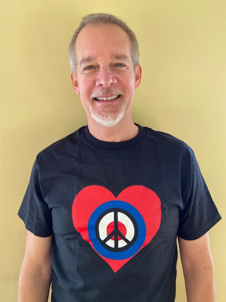
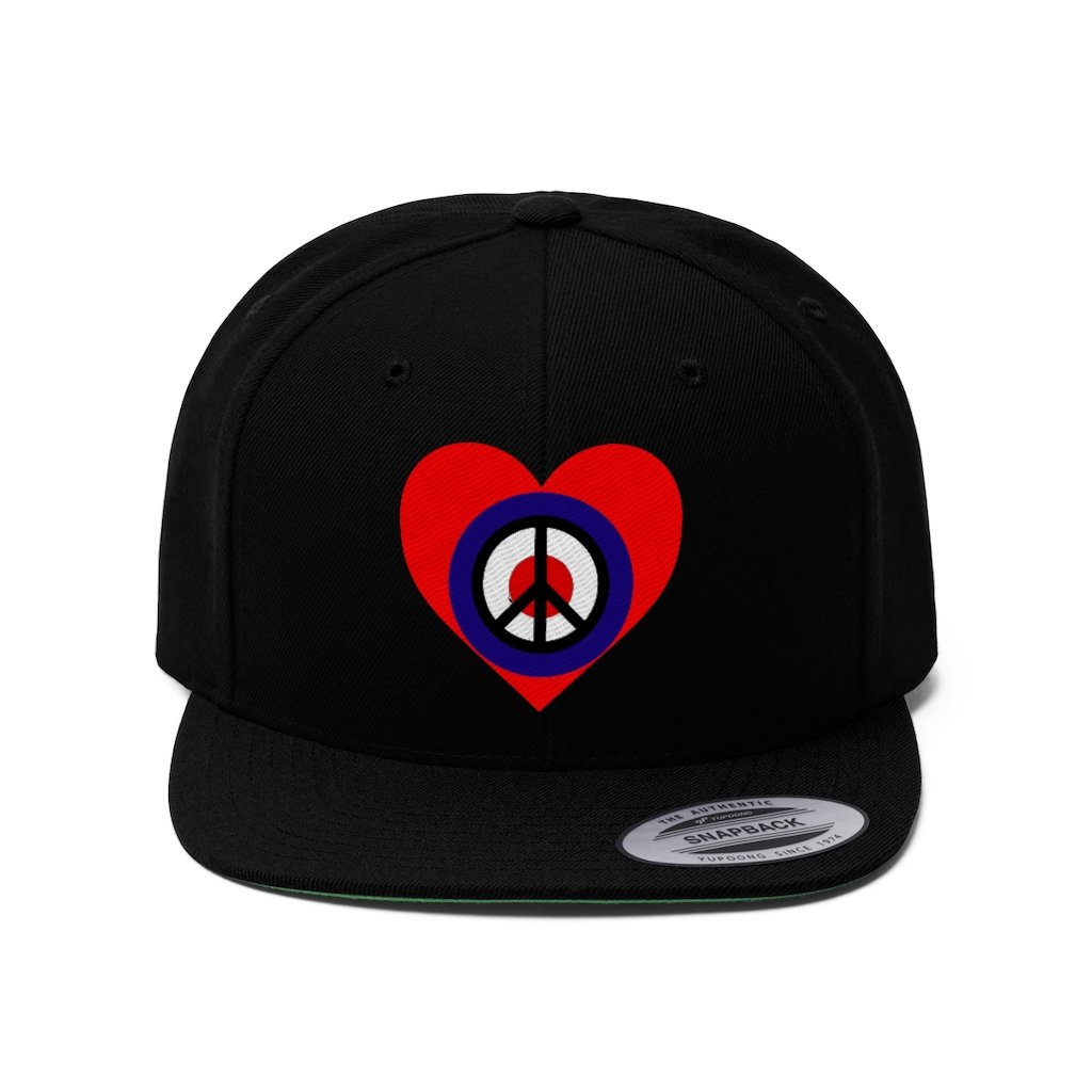
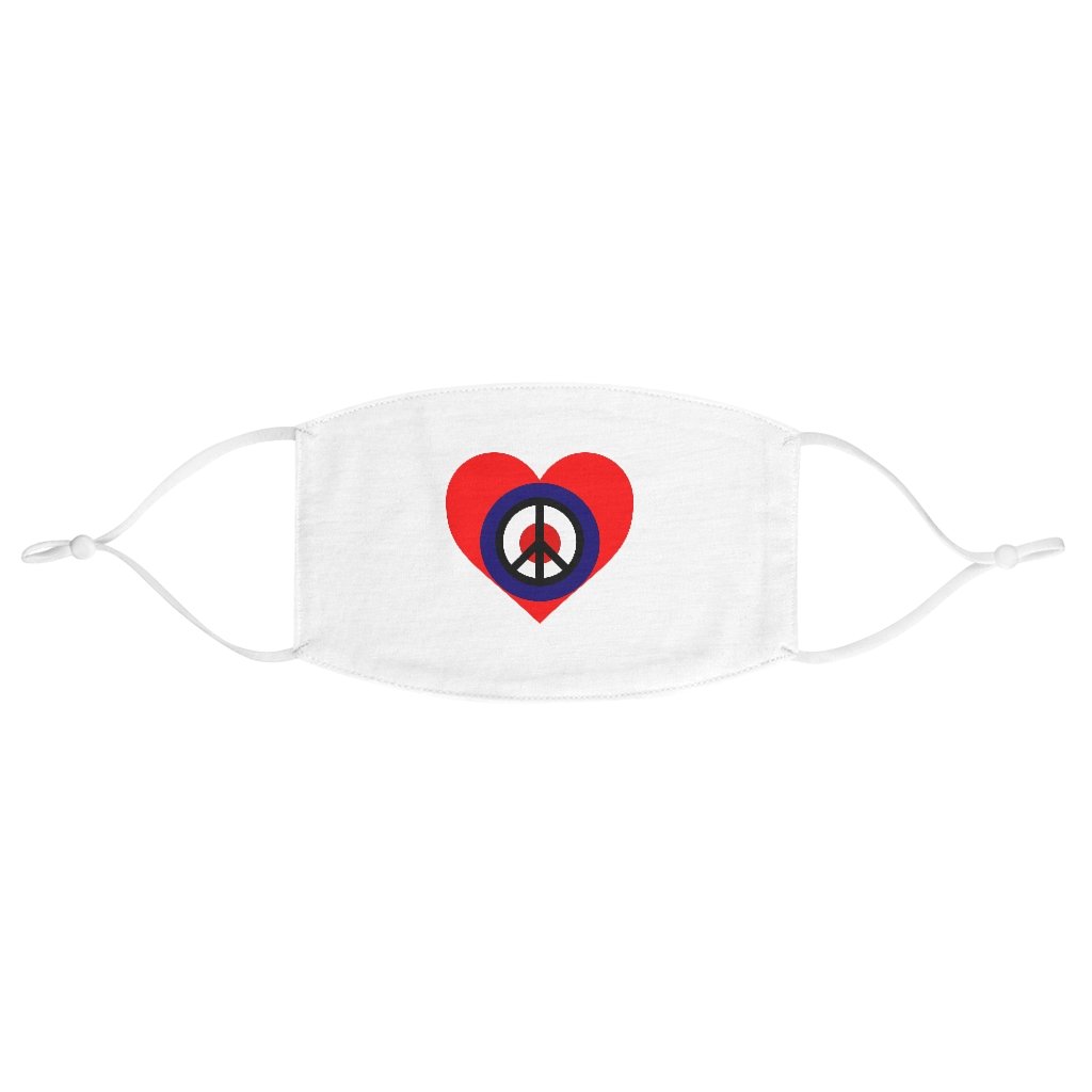
It’s Black Friday – and just in time for your holiday shopping, my merch store is ready to take your orders. T-shirts, mugs, facemasks, and all kinds of items are emblazoned with my logo of peace, love, and music.
Coming up with a logo is a tricky thing: trying to find a solitary image to represent all the products that fall under its umbrella. Since my music is the product I want to represent, my challenge was to create something visual to represent something musical.
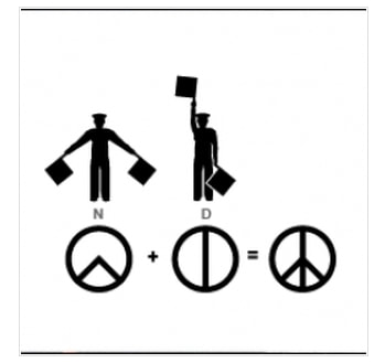
The peace sign was designed by Gerald Holtom for the British Campaign for Nuclear Disarmament in 1958 using the semaphore symbols for “N” and “D.” It is an elegant symbol for a concept that still has the potential to save our species and our planet.
The heart is a universal symbol of love. Most likely, the feeling that we consider love originates in our brain, but who wants to get a box of chocolates on Valentines Day in the shape of a brain? Even more than peace, love is the concept that will save us with its transformative, transcendent power.
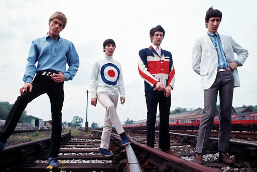
Peace and love are all well and good, but this is music, not philosophy, so I wanted something to visually represent the yearning and passion that drives my music. Jasper Johns in the US and Peter Blake in the UK used rondel symbols in their pop art of the 1960s, and Mod bands of the era adopted the Royal Air Force’s version of the rondel – blue, white, and red concentric circles – to brand their music. The bands that came out of that era in the UK – The Who, The Kinks, The Beatles, and The Rolling Stones among others – have been the greatest source of inspiration for my music.
If you are like me – a fan of peace, love, and music – follow the link at the top of the post to see the variety of products that have my logo slapped on them.


Leave a comment